
Project Summary
I led the design of Automind, the company’s very first product—an “AI second brain” built to help creators and knowledge workers manage scattered files and overwhelming information. Starting as a team lead among design interns, I explored user pain points, defined seven key modules, and guided design discussions under tight ambiguity. From challenging AI folder concepts to delivering a full component system, I balanced innovation with feasibility. Within five days of launch, our waitlist grew to 2,000+ users, validating the product’s resonance.
Main Features
File Display
Presents all stored files in a chronological, card-based layout. Each card can be clicked to open its detail page, while management actions can be taken directly on the homepage.
Wait a minute, the video will be up soon...

Folders & Smart Folders
Folders: Manually upload and organize the file.
Smart Folders: Work as dynamic collections defined by user-specified tags or search terms. Once created, these folders automatically classify and organize new content that matches the criteria, ensuring effortless and intelligent management.
Wait a minute, the video will be up soon...
Wait a minute, the video will be up soon...
Multi-source Upload
Desktop/Web: Capture full webpages or extract specific text and images directly.
Mobile: Upload images, videos, audio, text, or links via the official WeChat account.
Wait a minute, the video will be up soon...
AI Copilot
Enables users to send any stored file to the AI via drag-and-drop or selection. Through natural language interaction, AI can interpret, summarize, or extract insights from documents, making knowledge processing faster and more intuitive.

The schedule for next Friday conference.
8:30 - 9:30 Check-in
...
Learn from yesterday, live for today, hope for tomorrow.

@NOtmine
Message
NOtmine
Today at 09:41
Hey! Check the best furniture stores I found in NYC!
Here is the list!

@SLeepyMe
Message
SLeepyMe
Today at 09:41
The long term annual average temperature in New York State is approximately 45° across the state.
Friday November 16th, 2024.
Welcome
Group Session
Celebration
Send from
Your reservation is tomorrow.
Confirmation #: 2110697
@
Send from
Hi Avery,
Hope this email finds you well.
@
My Teams & My Role
My Role
Product Designer; Team B Leader
Duration
Sep, 2023 -Feb 2024
(5 months)
Tools
Figma; Midjourney; Lottie Files
Collaborators
Jie Li (Product Director); Lucia Zhao; Yina Dong; Christine Wang; Lin Li

Section 1
Kickoff · Stakeholder Interviews · Requirements Gathering
The Company’s First Project Asked Us to Design a Second Brain
At kickoff, I realized the scale of our ambition. This wasn’t just a new product; it was the company’s very first, and it carried the lofty promise of simulating a “second brain.” I felt the tension between the bold vision and our inexperience as interns. But seeing how creators struggled with scattered, unstructured knowledge made the challenge feel urgent and real. That urgency, more than guidance, became the fuel that kept me moving forward.

Second Brain - Multimodal AI
Second Brain - Multimodal AI
The kickoff asked us to design nothing less than a ‘’second brain‘’
Section 2
User interview · Insight synthesis / Data analysis · Empathy mapping
Their Files Were Everywhere, and Nowhere at Once
Analyzing surveys with the design lead, we saw the same frustration repeated: creators’ files were scattered across platforms, in formats tools couldn’t unify. When they needed something, it became a scavenger hunt through tabs and drives. To me, this crystallized the real problem—not storage capacity, but the anxiety of never knowing where your own knowledge lived. That clarity sharpened my empathy and gave us the responsibility to make retrieval feel effortless.


Knowledge scattered across platforms & Retrieval turned into a scavenger hunt
Section 3
Concept ideation · Problem framing (diverge→converge) · Journey mapping
Smart Folders Looked Brilliant, Until They Became Incomprehensible
Our first proposal—AI auto-sorting files into endless tags and folders—looked innovative, but I pushed back. Users wouldn’t know where anything lived, and categories would shift unpredictably as content grew. That lack of control clashed with how people actually retrieve knowledge. I reframed the idea: instead of static folders, “AI folders” could be dynamic collections born from searches. It turned a confusing promise into a simple truth: make search smarter, not storage messier.
Folder
Folder
Folder
Folder
Folder
Folder
Folder
Folder
Folder
Folder
Folder
Folder
Folder
Folder
Folder
AI-generated folders quickly became untraceable
Cats
Dogs
Create Smart Space as“My Pets”


Cats


Dogs
99+
My Pets
Redefining them as dynamic searches simplified retrieval
Section 4
Information architecture / Sitemap · Wireframe creation · Workshop facilitation
From Chaos of Ideas, Seven Pillars Emerged
After weeks of brainstorming, I guided the team to consolidate scattered concepts into seven product modules—cards, search, AI inspiration, AI folders, AI copilot, login, and settings. It was messy work, but this structure grounded us. For the first time, the “second brain” was no longer abstract. It felt like building the skeleton of a living system—one that would grow, but only because we had agreed on where its bones should be.
Smart Folders
Login
AI Copilot
Search
AI Inspiration
Cards
Settings

Section 1
Project management · Ownership mindset · Mentorship & coaching
Leadership Meant More Than Delegation—It Meant Guardrails
As B team’s leader, I wasn’t just assigning tasks. Many interns lacked experience, so I created checkpoints, reviewed drafts daily, and gave one-on-one feedback. At first I worried I was micromanaging, but I realized structure gave them safety to explore. The role taught me that leadership is less about control and more about building rails strong enough for others to experiment without derailing.


As team lead, I turned delegation into guardrails
Section 2
Conflict resolution · Agile / Scrum collaboration · Feasibility assessment
The Feature That Dazzled Us, but Died in the Review
Our boldest idea—AI generating new content based on user files—thrilled us, but the product director called it infeasible. Engineers confirmed the generation time and cost would disappoint users. I felt the sting of losing a feature we loved, but I also learned restraint. Innovation only matters if it can ship. The compromise reminded me: being right about the future isn’t enough—you must also be realistic about the present.

Bold, but not feasible—our AI generation feature was cut
Section 3
Wireframe creation · UX strategy · Responsive design
Every Screen Became a Test of What ‘Second Brain’ Really Meant
We finalized modules: simple login, immersive file cards, tags and notes in detail pages, advanced search with shortcuts, AI folders, and a persistent AI chat window. Each screen forced us to define what a “second brain” should feel like—frictionless, anticipatory, but not overwhelming. It wasn’t about flashy AI tricks; it was about subtle details that made users feel their chaos was finally under control.

Files surfaced as clean cards

Tags and notes turned chaos into clarity
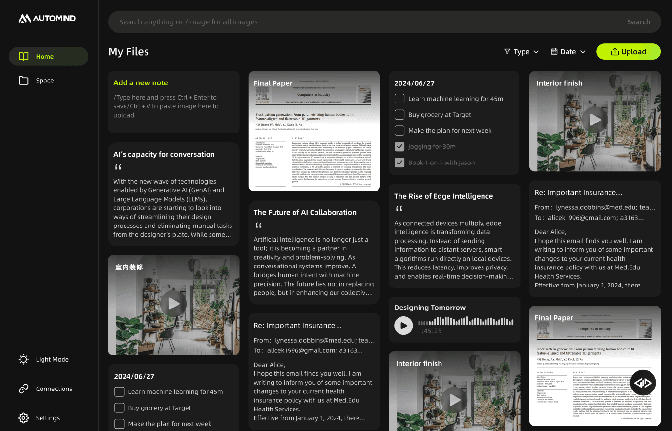
Exploration of the feature “Create Smart Space”
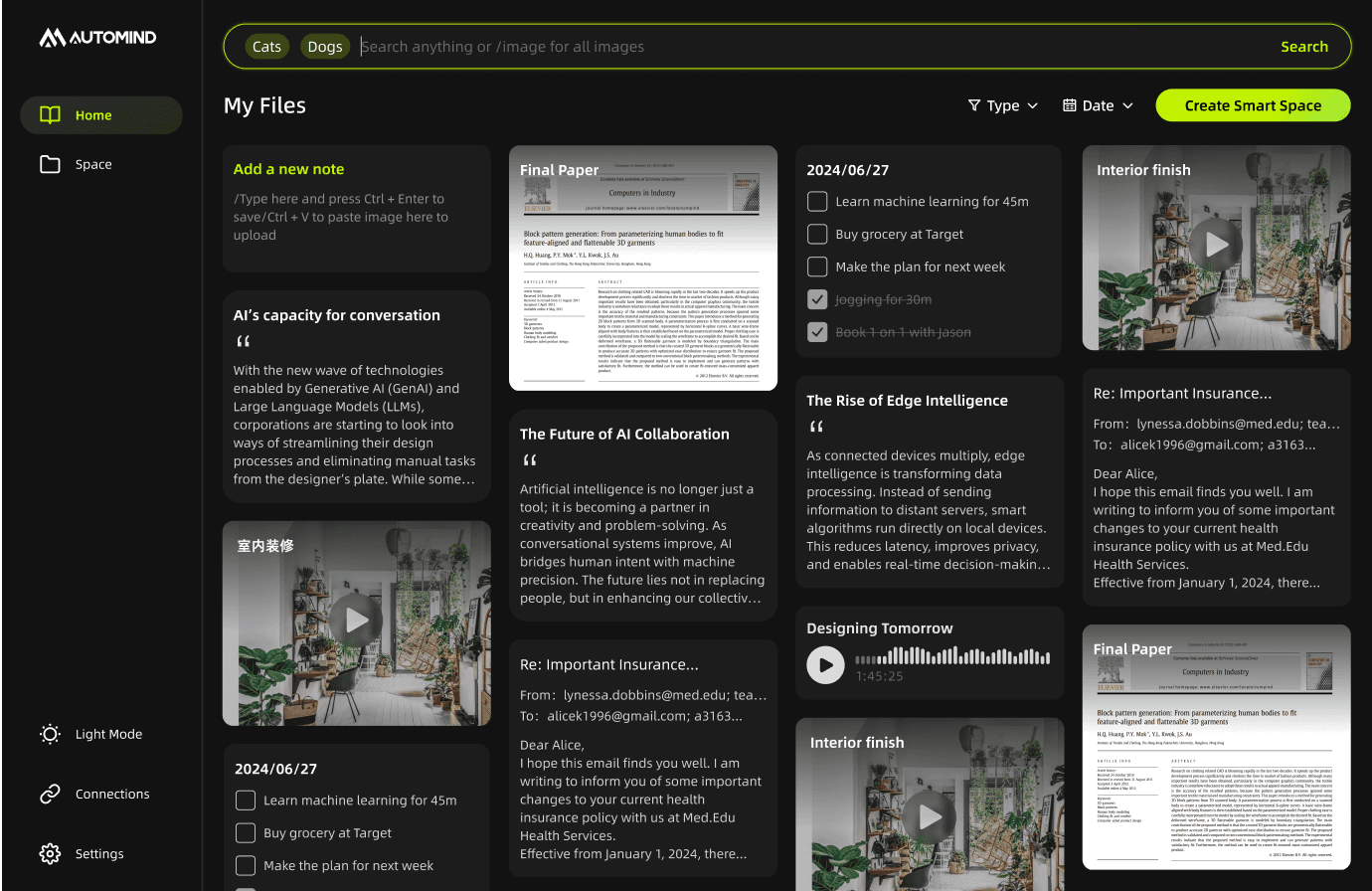

1st try- “Create Smart Space“ is not sufficiently noticeable

2nd try - For users focused solely on multi-tag searches, the button adds no value.

Final - A clear separation has been established between the search function and the “Create Smart Space” action
Exploration of “Create Smart Space” and 3 times experiments
Section 4
Design system / Style guide / UI kit · Cross-functional collaboration · QA support
Without a Library, We Had to Write Our Own Language
This being the company’s first product, no design system existed. I partnered with another designer to create components, document guidelines, and audit every detail across modules. It was exhausting, but it gave our product coherence—and it taught me that design systems aren’t just about efficiency. They’re how a young product begins to sound like itself. Within five days of our waitlist launch, 2,000+ users signed up, validating not only the idea but the consistency of its voice.
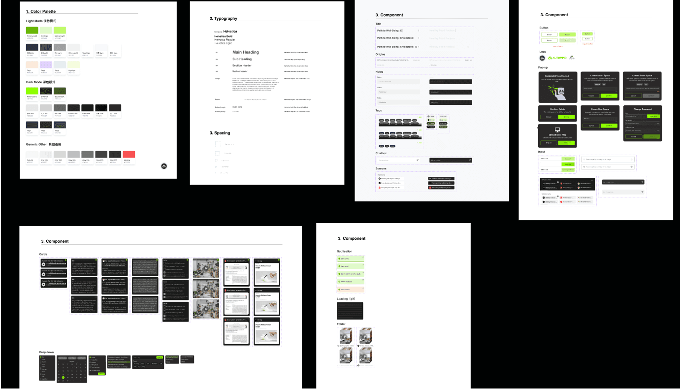
Our first component library gave the product coherence

2,000+ users joined the waitlist in five days

Annotations for animations of the landing page
Section 5
User Test / User Experience / Iteration / Redesign
Better user experience drives us to reflect and advance
We made three key adjustments based on usability and visual hierarchy.
(1)We moved the upload button to the same level as the right-side card, aligning it with user attention hotspots and making the action easier to access.
(2)To declutter the homepage and minimize hesitation, we removed folder tags under the search bar.
(3)We fine-tuned the card styles and colors to simplify the interface and create a more immersive, focused experience.
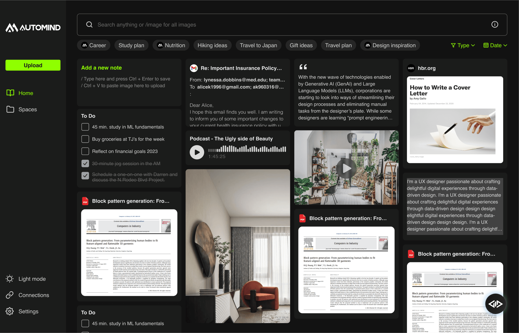
Before - comprehensive in functionality but somewhat complex

After - A more immersive and streamlined operating environment